School Trend
Overview
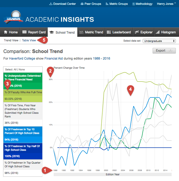
This view allows for many metrics to be compared against one school. The graph displays the percent change of the metrics in order to identify any possible correlations between them. Highlighting a specific metric will show the absolute values. The School Trend view can also be viewed as a data table. To switch between the two display options, click on the Trend View or Table View links directly under the visualization navigation bar.
Using this View

- The x axis shows the selected time frame (edition year).
- The y axis shows percent change over time.
- By clicking on a metric in this table, the corresponding line will change color to match the selected metric. Alternatively, you can click the line in the graph, which will cause that line to change color, and the metric in the table will match.
- Toggle to the Table View, which displays the data points as numbers, and not as percent change. This table will show all values regardless of different units of measurement.
- Users can also select a timescale by dragging their mouse over your desired interval.
Note: Exporting as an image from the Table View is not possible. Export this view "as data" to see the tabular data as a CSV file. This is available only with a full subscription.