Explorer
Overview
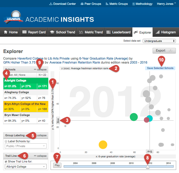
In this view, you must select at least two or optionally three metrics to display a customized scatter plot; one for the x-axis, one of the y-axis. A third metric can be selected to determine the size the circle (z-axis). The view can be animated and played over a selected time frame. The circles will move in relation to one another based on the data.
Using this View

- Both the x and y axes are dynamic. You can pick which metrics you would like to display for each.
- Add another dimension by selecting a metric for the size of the bubbles on the chart. You can also use this view without selecting a metric for "z".
- The "avg" flags mark the average of the selected group for both the x and y axis for each year.
- Click a school name in this table and the corresponding bubble will be highlighted in the same color. Alternatively, you can select a bubble on the plot and the school name in the table will be highlighted in the same color.
- Group labeling will allow you to group your chosen schools or peer groups into particular groups. The fields include: by peer group, classification (only Undergrad) or public vs private. To activate group labeling click the "Label Schools by" icon. A key displaying what each color corresponds to will appear below the box.
- The trail line option adds a trail line to a selected school while the animation plays. To display a trial line click the Show Trail Line for" icon and select the school for which you want to see a trail line.
- Play or pause the graph animation over the selected time frame.
- Drag the arrow along the timeline to display the data for each year.
- Collapse the menus to view the graph at a larger size.
- Click here to create a Peer Group from the schools that you have selected within this graph. You need to select at least one school for this button to appear.